4 Easy Ways to Accommodate the Visually Impaired
- February 15, 2018
- / Adot Pro
- / learningcenter

Web accessibility is an essential part of inclusivity and equal opportunity. The Internet is an opportunity for unprecedented access to information from all across the globe.
So what does it mean to accommodate someone with visual impairments? Visual impairments don't always mean blindness; no two people are alike, but it's essential to assist as many people as possible.
1. Be conscious of your font choice
Is the font on your website or blog hard to read? Try to keep things simple by selecting a font that is easy on the eyes. This means choosing a simple font like Times New Roman or Helvetica can do wonders for your visitors. These fonts may be old school, but they are just suggestions! The below graphic is an example of some extreme differences, but the basic concepts remain the same.
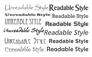
If these fonts don't work with the look with the rest of your website, feel free to choose something else. The secret? Choosing something that you KNOW will work for everyone. As for font size? Try to keep it at 18pt.
2. Pay Attention to the Color Contrast on Your Website
Why is color contrast important? Approximately 1 in 8 people are partially or fully color blind. Color contrast can be tricky, but don't fret. There are TONS of tools out there to test different color combinations.
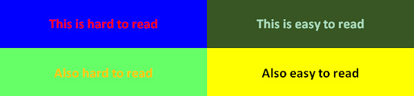
We're confident you'll find something that will work for you. Check out this tool from ColorSafe that will help you choose your compliant colors.
3. Text Overlaid on a Background Image
We've all seen it: an image that has a text overlay that makes it hard to read. It's hard on the eyes for us, but can you imagine what it's like when someone has a visual impairment? No worries though, because this one is an easy fix.
The below image has white text on a photo background. Even if we changed the text to black, it would still be hard to read.

In the below image, we put a very thin overlay on the image before placing the text. See how much it improves readability? It's like magic.

4. Color Filters for Your Online Store
In the example below, the online store is offering 2 different colors of shirts. One is black, and one is a light blue. But if you are color blind or rely on visual cues, how do you know?
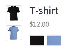
(Source: Shopify.com)
If you have an online store, always make sure to include a color description in addition to your color selection.
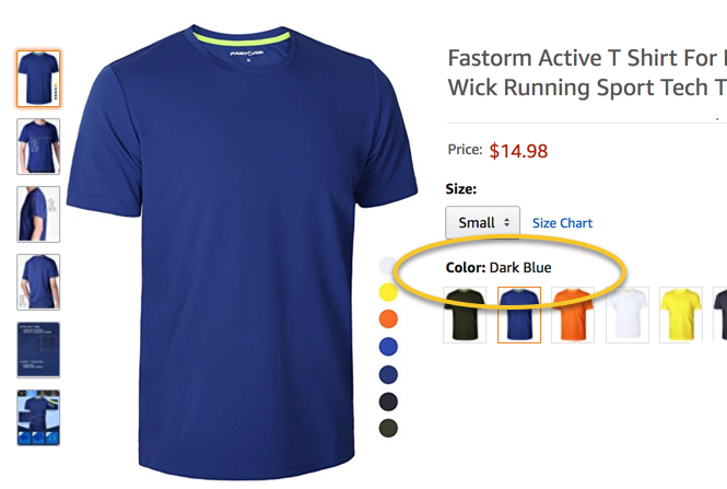
In this example, the online store gives you the color name in addition to the swatch to choose from.
It's the little things, you know?
Conclusion
This article doesn't cover all the different ways you need to accommodate those with visual impairments, but it does cover some critical bases. Remember, your website is meant to look and feel good to EVERYONE who visits. Taking these baby steps are important, not just for you, but for your website's visitors as well.
For additional information on increasing your web traffic by ensuring that your business is accessible, contact Adot Pro today.
Recent Posts
-
 ADA Lawsuits Target Non-Compliant Websites (2:45)
-
 Winn Dixie Loses ADA Website Lawsuit (3:33)
-
 How Does it Work?
-
 Adot Labs Introduces Adot Pro as an Affordable and Quick Solution for Web Accessibility
-
 What is an Accessible PDF?
-
 Adot Pro is featured at the 2017 FRLA Conference in Orlando
-
 Adot Labs Partners with the Florida Restaurant and Lodging Association
-
 Content Developers: You're Forgetting a Key Audience that Matters
-
 What is Web Accessibility?
-
 Why Your Business Needs an Accessibility Plan